How Color Contrast for Accessibility Helps Mobile Experience
How Color Contrast for Accessibility Helps Mobile Experience
Catharine McNally | Accessibility Specialist
April 1, 2013
Did you realize that improving color contrast for accessibility also improves the mobile experience for all users? Think about when you use your mobile phone outdoors--have you found yourself covering the screen from the glare of the sunlight for better readability? If you can’t read the text, then the website more than likely has poor color contrast. At Phase2, one of our sites, the Thompson Reuters Summer 2012 Olympics Site had black background with white text, the highest color contrast ratio possible. This was optimal because as a sports site with constantly updating stats, people were viewing it in many different conditions including outdoors! See below for the simulated screenshot of an indoor vs. outdoor view:
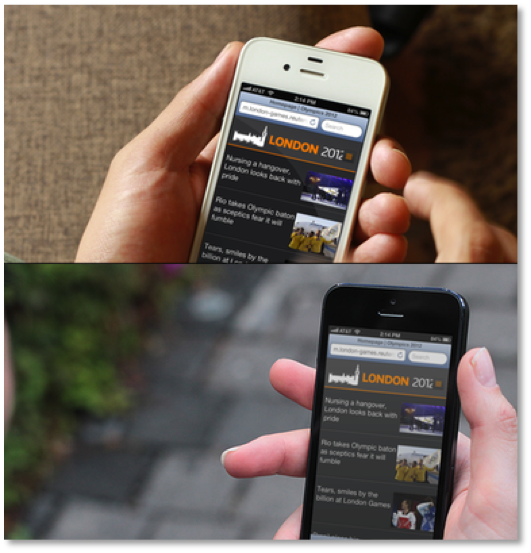
Notice that the indoor image on the top has very high distinction between the black background and white text. The image beneath is outdoors, and the contrast has been lowered, yet it is still readable. Imagine, though, if the main site image was on gray background with white text? That’d be hard enough to read indoors on a desktop, so imagine trying to read it outdoors when you’re waiting in the food truck line.
Taking the Color Contrast Test
So, does your website have high enough contrast? Here’s how to find out! 1. View the page design in grayscale. Can you easily discriminate between the foreground and background colors? 2. Use a handy web tool to test the contrast “live.” This is my favorite browser add-on, available in Firefox: WCAG Color Contrast checker. To use this tool, follow these short steps:
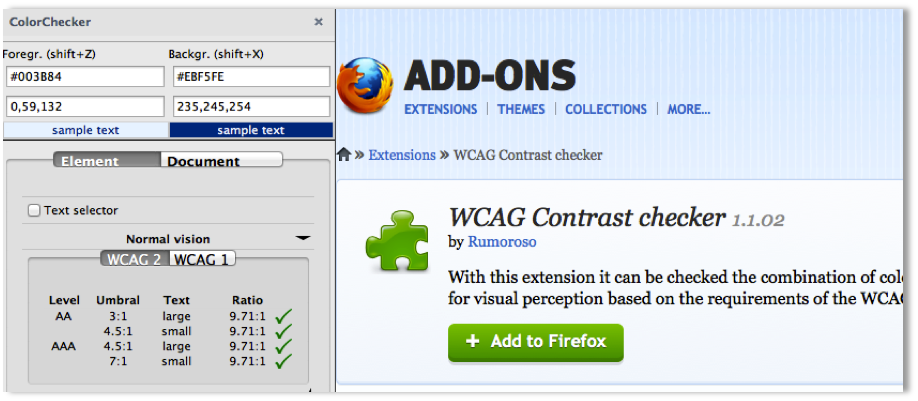
- Take your mouse over the general area where you’d like to test,
- Select “Shift + Z (or X for background)”
- Take the mouse cross-hair to the color to be evaluated
- Hit “enter” to copy this to the clipboard
- Paste into the text field.
The color contrast ratio will be indicated by either a green checkmark symbol (pass) or a red “X” symbol (fail). Additionally, if you already know the color values of your site or want to be able to use a color-picker to spot test, you can use Juicy Studios color luminosity calculator.
How to Pass the Test
We all want to pass with flying colors! (no pun intended). In the WCAG Contrast checker, and other testing sites, you will be presented with a color contrast ratio between the foreground and background. Here is the criteria for the contrast to be considered high enough for passing:
Large Text:
Typically applies to headings, menu navigation links. Large text is classified as text equal to or greater than 18 pt font that is not bold; and text equal to or greater than bold 14pt font. It must pass a color contrast ratio of 3:1.
Small Text:
Mostly the copy on a website. Small text is classified as text equal to or less than 14 pt font (bold) or 18 pt (not bold). If you already know the color values or want to use a color picker to evaluate using a color contrast calculator, you can use the color luminosity calculator by Juicy Studios.
Clear Messaging
Hopefully this all makes sense and you can get started with testing. More importantly, this is a great example of how accessibility best practices can have a ripple effect in greater usability of the site. After all, you do want your sites messages to be clearly read and understood by your audience, regardless of how they access the content!