Getting Started with Lit2 Web Components
Getting Started with Lit2 Web Components
Jake Strawn | Principal Engineer, Frontend
April 11, 2022
Phase2 has been using Lit2 since it was a release candidate, and we have implemented or are in the process of implementing it on over fifteen initiatives. Additionally, Lit2 is the foundation of our open source design system, Outline. I discussed in a previous blog, Web Components: Our Journey from Lit to Stencil and Back Again, the rationale and effort it took us to land on standardizing our component building with Lit2.
Today I’ll go more in depth into some of the basics of building Web Components with Lit2, and briefly cover a variety of topics including:
- Scaffolding a new component
- Rendering content
- Conditional rendering
Class and Custom Element Declaration
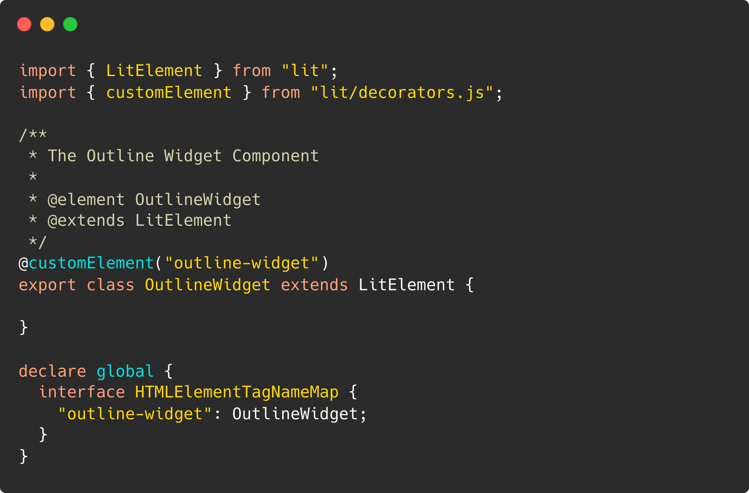
New Web Components are declared using Lit’s @customElement decorator. The following example shows declaring a new component class, OutlineWidget, creating the new custom HTML element, <outline-widget>. This would be equivalent to calling customElements.define('outline-widget', OutlineWidget); in a raw JavaScript component.
This first example is extending LitElement as the examples you'll see in the Lit Documentation.
This next example utilizes the base class in Outline, OutlineElement. All the components in Outline extend this class, or have a parent element that extends it. Class extension in Lit allows us to use OutlineElement or any other component to provide functionality inheritance to other components that may extend and utilize the class.
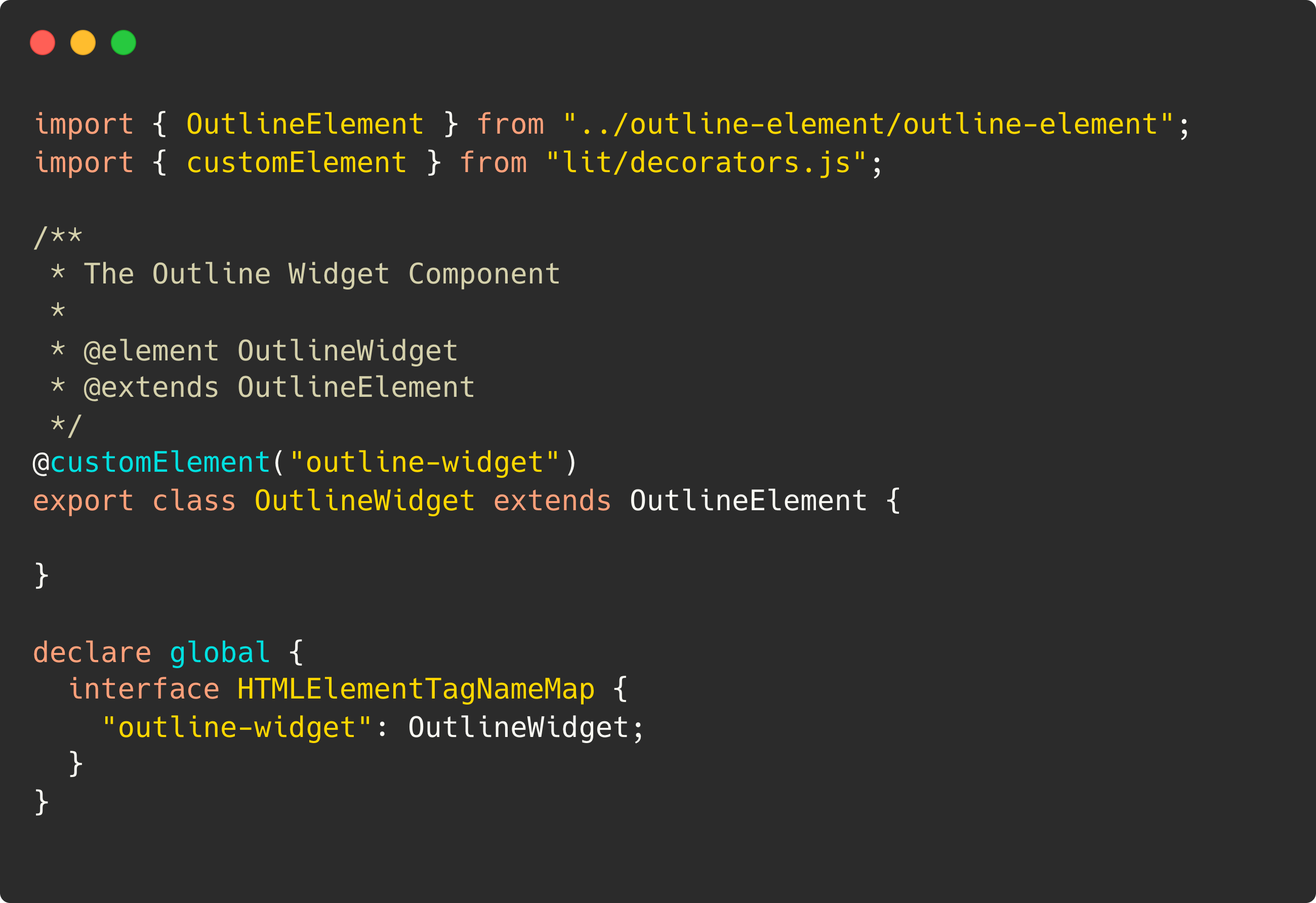
In many examples throughout this post, and subsequent posts, you’ll frequently see us extending OutlineElement. If you are not using Outline, just consider LitElement as a drop-in replacement for any code snippets.
Rendering Content
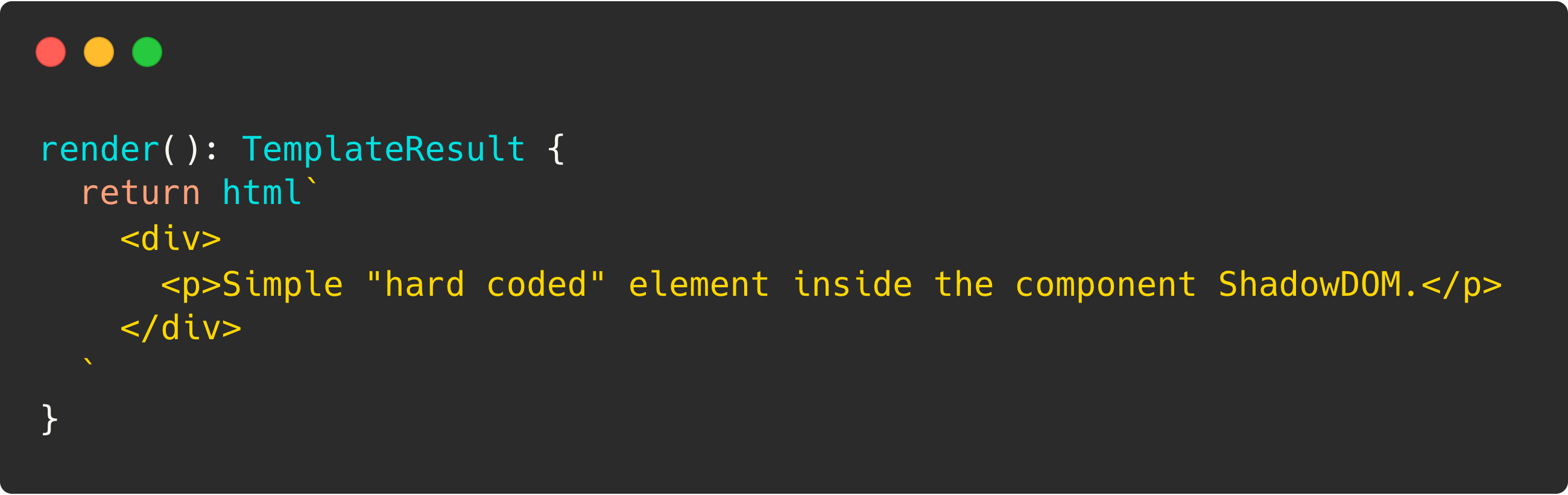
The Lit render method is what allows us to compose and return any markup required for our component. In this simple example, the render method is simply returning hard coded HTML markup. Most Web Components we develop would rarely, if ever, contain hard coded HTML, as the components we build are designed to be flexible and reusable, which calls for a more dynamic render method. Yet, there’s absolutely nothing wrong with returning simple HTML markup exactly as shown below, especially in the case of testing out basic samples, and building upon something known, static HTML.
Conditionally Rendering Content
Now, let’s assume an actual, real-world scenario where we would want to render something besides static HTML. Let’s take a look at an actual sample from our outline-link component. It is one of our most basic components, yet has a flexibility that makes it a great example for what some “complicated” logic in your render method may look like.
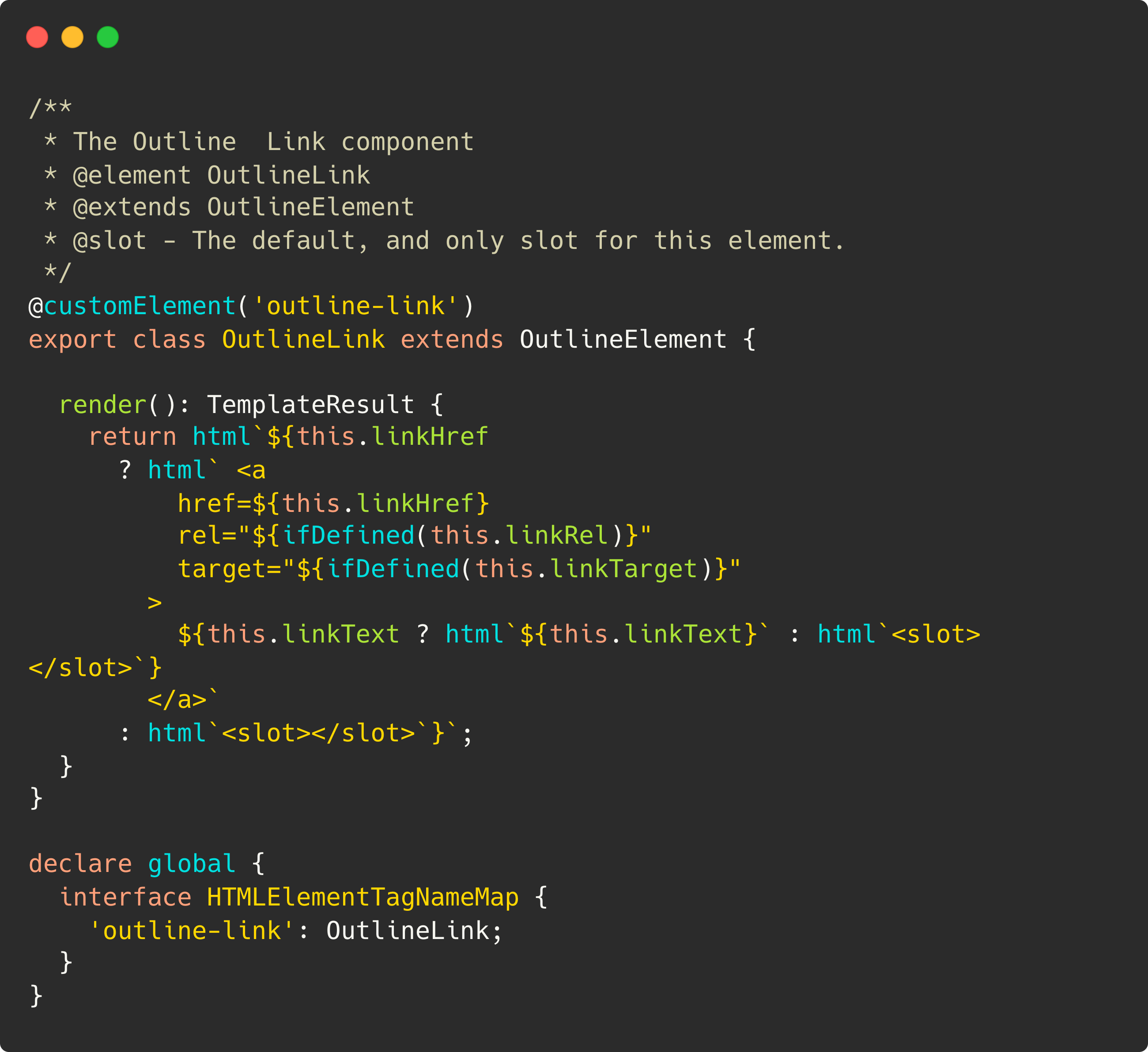
Now that got complicated in a hurry! Let’s break down the above code a bit. Without diving deep into properties and slots which will be discussed in depth in future posts, let me describe how this is working.
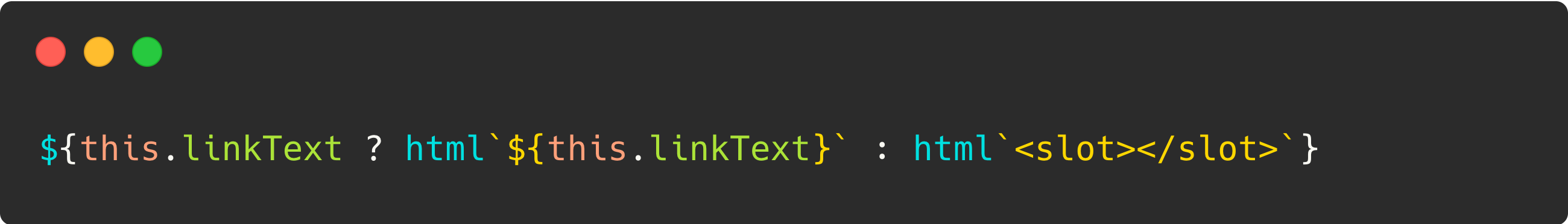
If we break out the markup and nested ternary condition in this example it may be more clear what’s going on:
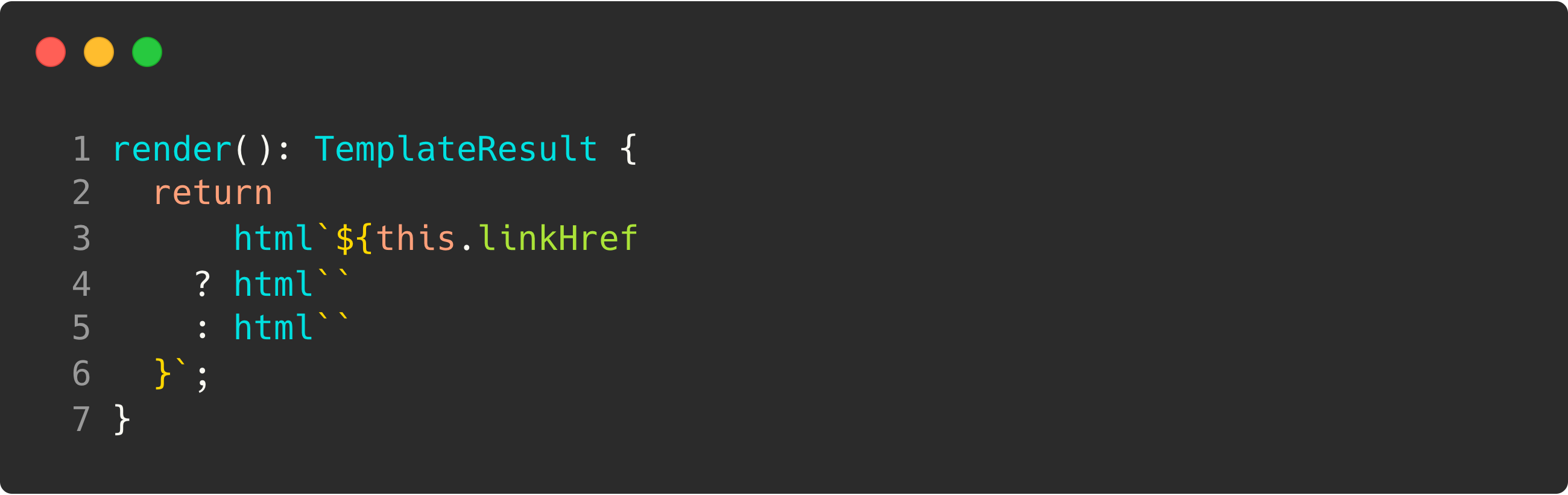
Now, the linkHref property on our outline-link component can be either string or boolean. By default, it is false. So, the above logic simply says:
- If
linkHrefhas a value that is notfalse, we will return the template literal on line 4. - If
linkHrefdoes not have a string value, and isfalse, therendermethod will return the template literal on line 5.
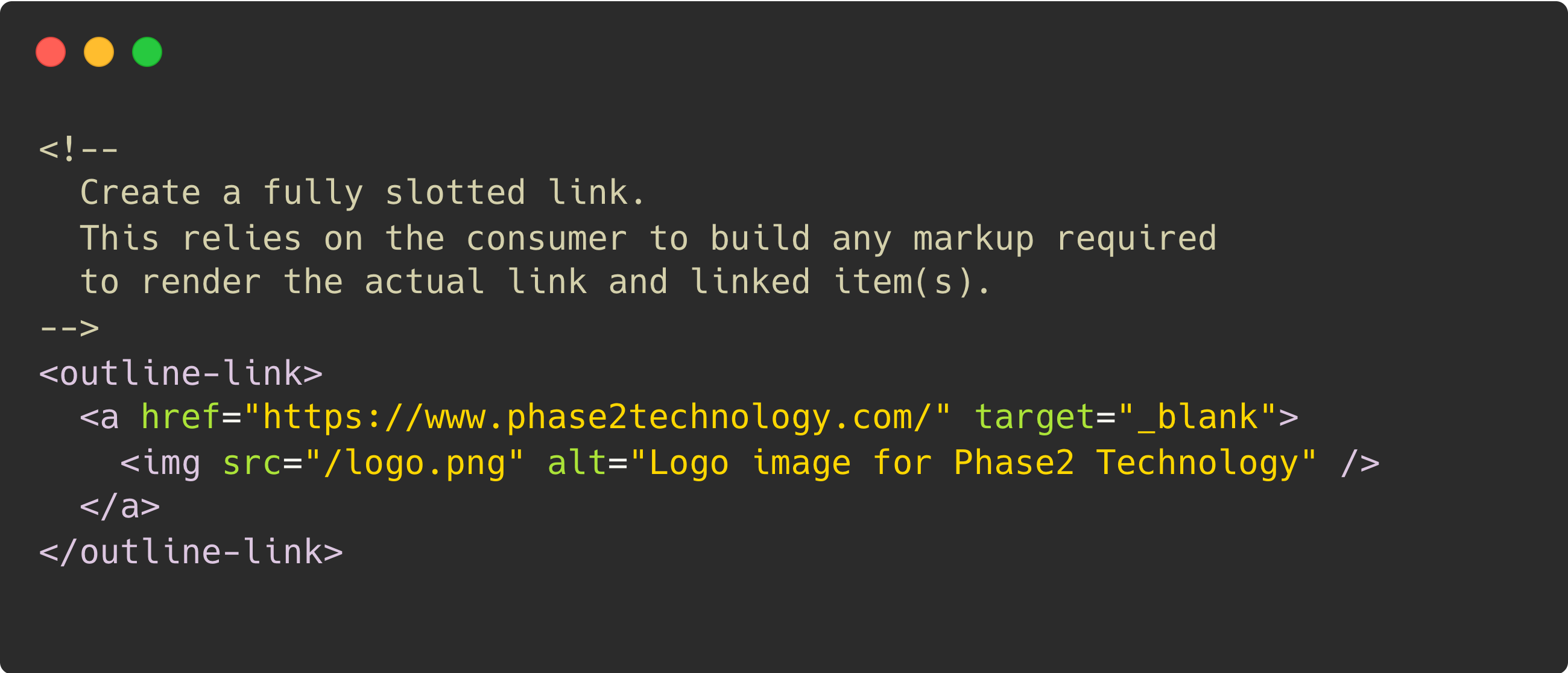
Next, let’s take a look at what code was in that ternary false condition above (line 5) before we simplified.
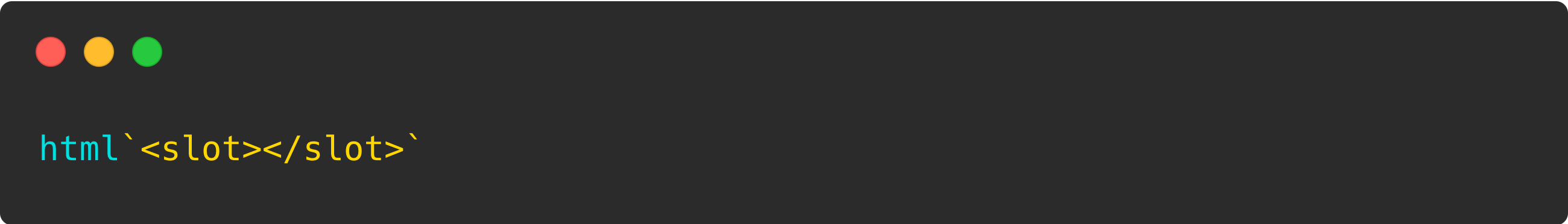
This is the simplest functionality we could allow in our outline-link component. This allows a consumer application like Drupal to pass into an outline-link component a fully slotted link. The contents of the next two slotted samples would live in the LightDOM. This would look something like the following in a basic consumer:
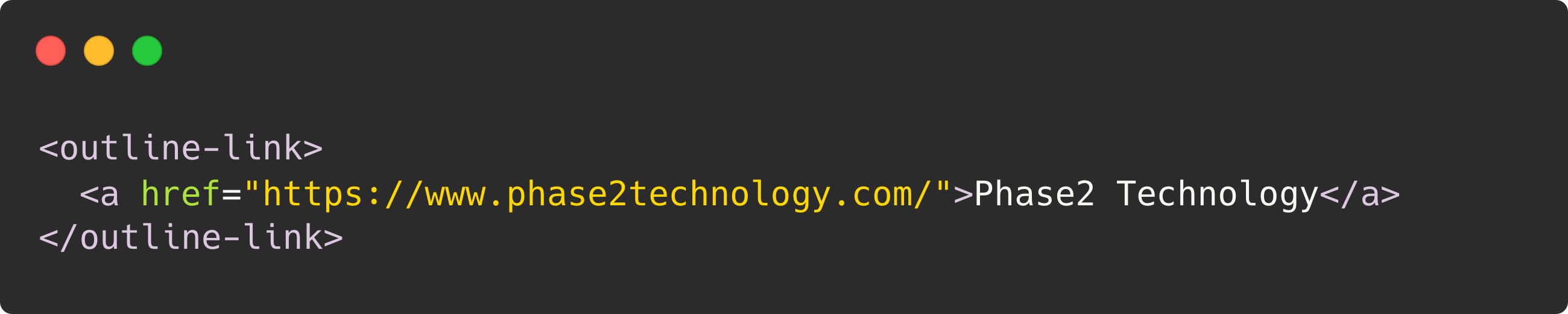
The benefits of this are that we can wrap any link in the consumer system, even ones that may have come with additional attributes already added, or even ones that pass an entire image into the link component, there’s nothing wrong with this:
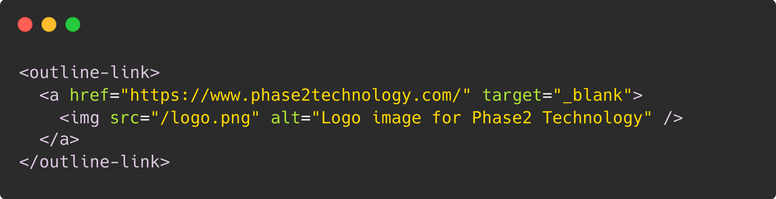
The “issue” the above flexibility introduces, is that we have to account for varying styling scenarios when considering what items may be allowed to be passed into this slot. But it lets us style things that are slotted the same—as we would a link that used properties, like the next example.
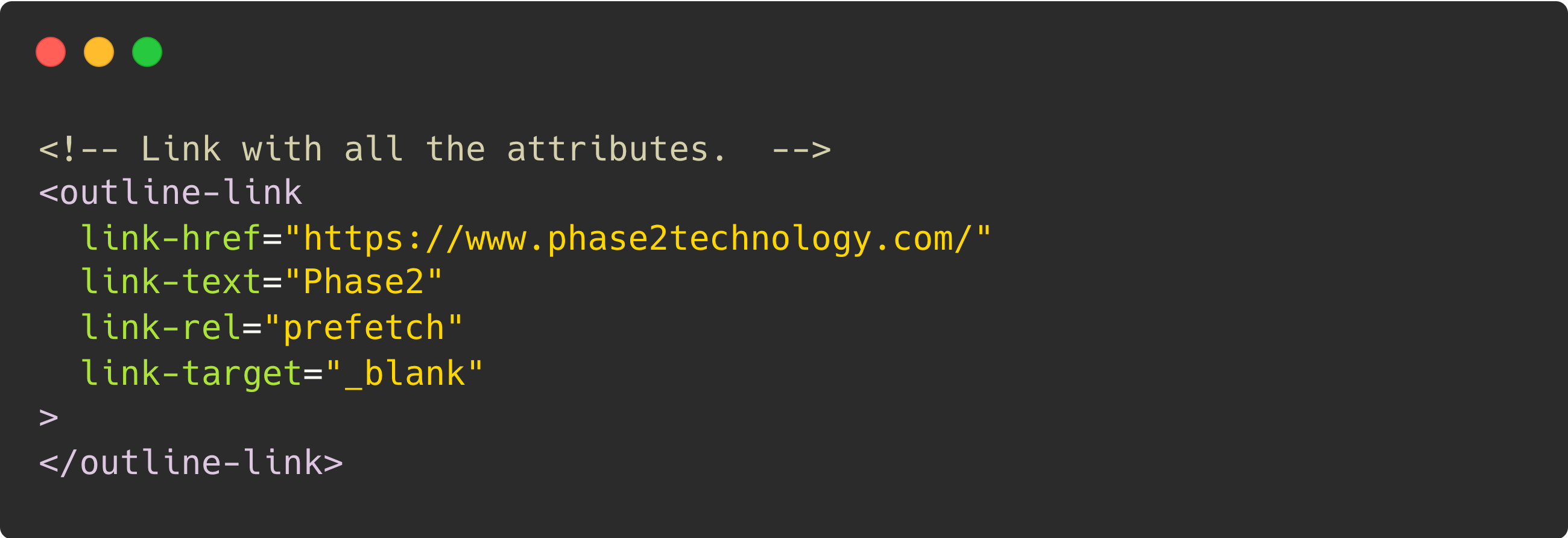
Now, we will take a look at the larger render method again, and look over what happened when linkHref returned the truthy value of a string that will be the URL of a link built in the ShadowDOM.
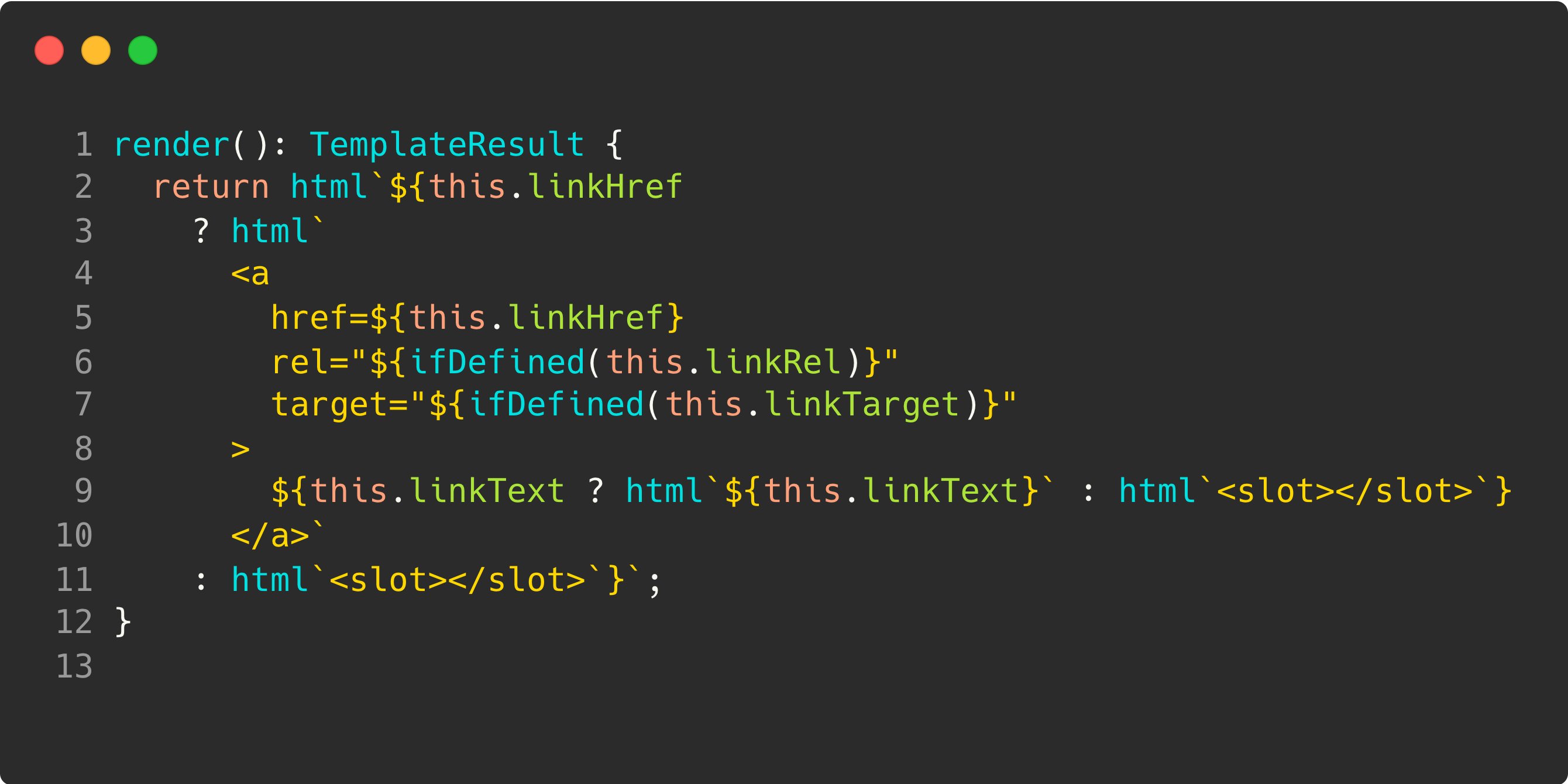
Notes on the above screenshot:
- Assign
this.linkHrefto thehrefattribute on the<a>tag (line 5). - Assign
this.linkRelto therelattribute on the<a>tag if it is defined (line 6). - Assign
this.linkTargetto thetargetattribute on the<a>tag if it is defined (line 7).
Now we’re to the meat of our component where we are going to pass in the relevant text to the <a> tag.
Here, we have a nested ternary condition that does the following:
- If
linkTextwas passed using thelink-textattribute on theoutline-linkcomponent, then we will use that text between the opening and closing tags for the link. - If
linkTextis not passed as an attribute on the component, then we will again turn to the slotted content, and use the text passed into the slot.
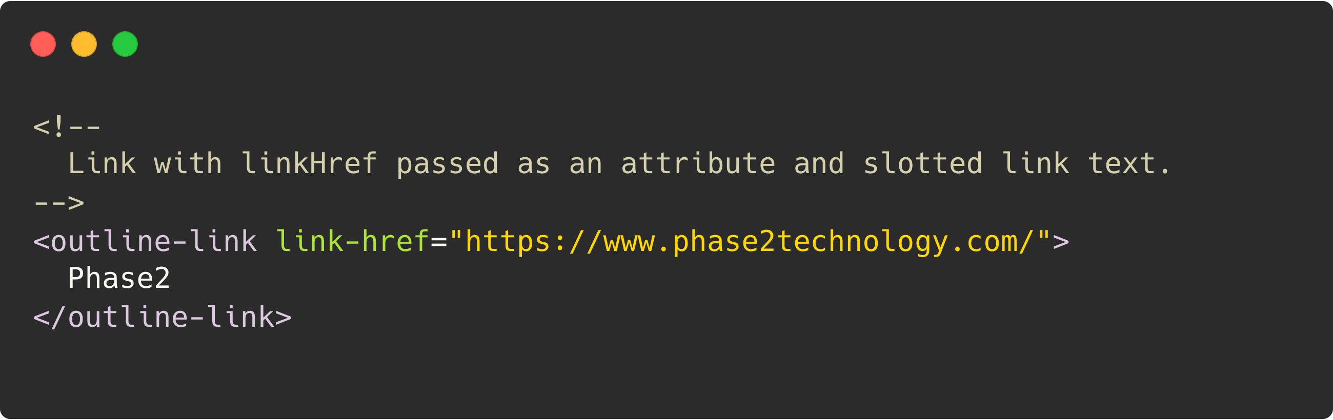
Finally, let’s look at all the things we’ve discussed about the inner workings of the outline-link component in practice with standard HTML markup.
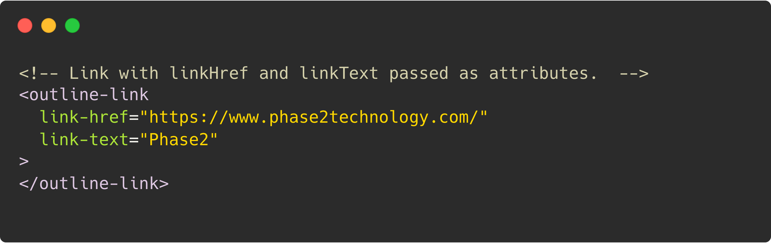
The above section really dove into one of our most simple, yet most flexible components, outline-link. It should serve as a pattern of ensuring maximum flexibility in your components, even in the simplest of usages.
Want to Learn More?
Well, I’ll be the first to admit that this “introduction” to Lit2 Web Components ended up being fairly in-depth. However, the concepts covered here will serve as a great foundation for our future posts on implementation methods.
The bits we covered including basic component declaration, rendering basic markup and rendering content dynamically, are all techniques that we will use in any of the components we build. We’ll be moving into future topics to take a deeper dive into Template Partials, Reactive Properties, Slots, and much more!
The code samples and screenshots used in this post can be found in this GitHub repository.
I hope you enjoyed reading the Phase2 blog! Please subscribe below for regular updates and industry insights.