The Big, Bad Layout Builder Explainer
The Big, Bad Layout Builder Explainer
Caroline Casals | Software Architect
March 12, 2019
Buckle up!
Layout Builder is here.
Chances are you’ve heard about Drupal 8’s Layout Builder, and maybe even seen one of those fancy demos. If 2018 was the year of promises for Layout Builder and other exciting Drupal 8 improvements, then 2019 is the year those improvements get into the hands of Drupal developers and content editors. 2019 is the year these features are live.
We recently had the chance to work with Layout Builder to bring new sites to life. After standing up to the rigors of the real world, we’re excited to share our experiences.
Why Layout Builder?
Before we talk about why Layout Builder is exciting for content authors, developers, and the Drupal community, lets just take a second to appreciate what it looks like.
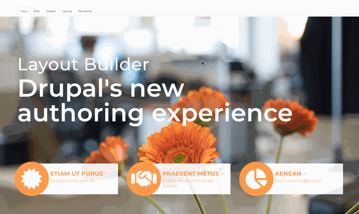
The Layout Builder per page editing experience
Fantastic isn’t it?
It’s what Panels always wanted to be, but never quite pulled off. It’s a flexible, demo-gorgeous admin interface. It uses those contextual links in a way that feels natural. And we get to keep our structured data. This is an advantage over systems like WordPress’s Gutenberg editor.
Simply put, Layout builder allows for fielded content on the backend, but a true drag-and-drop, front-end editing experience.
The improvements to the authoring experience are huge.
When’s the last time you heard your editors gasp during a Drupal admin interface demo? It’s not just impressive to look at, it’s also intuitive. It simply works the way today’s users expect, meaning we need less training time with content editors. Even Drupal veterans have something to gain. By seeing changes previewed immediately, we’re saving our content editors from the dreaded edit form roulette.
This good news on the Authoring Experience front doesn’t come at the expense of Developer Experience. The changes for developers are also great. Let’s take a look at what it takes to get a Layout Builder-driven site into production.
So you want to run with Layout Builder?
We love the tools Layout Builder gives us, but there are some things that aren’t super obvious when getting started. You’ll also find that there a few things that take a bit of getting used to…
How I Learned to Stop Worrying and Love the Block
Let’s just get this one out of the way: Layout Builder is all about blocks. It’s blocks all the way down, and there’s no avoiding that. If you have a deep seated hatred of blocks, we won’t judge, but Layout Builder is not going to be for you. However, we also need to mention something important:
These aren’t your grandfather’s blocks.
When we say “blocks” know that there are many kinds of blocks and they all play well with Layout Builder.
Note: The difference between a block plugin (the entity bundle) and the block entity (the instance of the block plugin) is crucial when working with and thinking about blocks.
Custom global blocks
Like the name says, these are globally available blocks. Probably, these are the blocks you are used to. They do what they’ve always done well: display shared global content in one discrete placeable nugget. In Layout Builder’s world though, they’re much easier to place and manage - no need to use the block region admin.
Custom inline blocks
These are new with Layout Builder. They’re like the fielded custom block types above, but they aren’t global. Each time you make one of these, they’re unique to the page or layout you make them on. That is obviously a huge benefit for making one-off pages without cluttering up the global block list with a thousand (or tens of thousands!) one-off blocks. Remember, blocks are true entities which means they are compatible with all your typical entity tips and tricks. The references to these entities are stored in the special, hidden layout builder field. More on that later.
Content field blocks
These are actually field blocks. So if you have a blog post content type with an author field, a fun fact field, and a body field, each of those is available to you in the layout as a placeable block. These are really useful for default layouts, which we’ll discuss later.
Programmatic or system blocks
Blocks provided by Core, contributed, or custom modules are also very much at home in Layout Builder. Remember that each instance of these placed is unique. That means you can have special configurations or titles for each placed instance of it.
Installing Layout Builder
When enabling Layout Builder, you’re going to rely on a few modules, and there’s one that is optional but we highly recommend:
Required - Core
- Layout Builder: Provides all of the essential features presented in this article! It includes a UI, a new field for storage, and the creation of custom inline blocks.
- Layout Discovery: This is a dependency of Layout Builder, it’s what allows *.layouts.yml files to be picked up by Drupal.
Optional - Contrib
- Layout Builder Restrictions: By default there are a LOT of blocks available to you in Layout Builder. This module allows for you to narrow down the list of blocks and/or layouts available to each display mode. It’s most useful for when you will be making heavy use of layout overrides.
That’s all that you need to install Layout Builder. To make it available, pick a display mode, any display mode, and enable Layout Builder to control it.
Default Layout vs Layout Overrides
Most of the fancy demos you may have seen with Layout Builder involve Layout overrides. While these are certainly very powerful, there’s a lot to be gained by using only a Default Layout as well.
Default doesn’t mean boring
Default layouts do pretty much what it says on the tin: control the render output and layout of all instances of that display mode. You use the Layout Builder interface to set up the default layout.
This gives us a lot of power while theming: we have explicit control over any layouts we want to declare in a *.layouts.yml file, and then we can control exactly how different elements are placed in those layouts (see more on registering layouts on d.o). This lets us get away from a very prescriptive node-template theming approach. Instead, we can create new display modes or update existing ones very quickly using our component-based design. The velocity gains towards the end of a project when the design and theming work for components are already in place are tremendous.
Note: Not using a component based design yet? Check out this article on how component based workflow can save you time and make your projects better.
So if Default Layouts control how all instances of that display mode are rendered, a Layout Override lets us define a different display for each specific instance (ie, just one node).
One of these things is not like the other
Let’s look at a practical example: We have a site where all press releases need to conform to a specific layout and style behavior. These are always governed by a default layout where all the fields and adjoining blocks (such as a “related content” block) appear in the same order, in the same layouts.
However, once a year there’s a special annual report press release. This has a lot of similar content to a regular press release (🐴), but Communications wants it to have some extra flair with a unique appearance every year, a few more blocks, and a snazzy background (🦄). In the past we might have needed to create a new content type, made the press release hideously complex, do node specific template overrides (🤢), or tried to place global custom blocks around the periphery of the node’s content. NO MORE! Now, we can create a layout override for the fancy year-in-review press release and it can look however we want without impacting “normal” press releases.
We allow layout overrides by enabling it on the display mode in question. In our example, on Press Release content type “full” display mode.
Note: “default” display mode is a funky special display mode. You cannot have a layout override for “default”. We recommend using the “full” display mode instead.
And the best part of this approach? We have separation of concerns between data structure and appearance! The fancy press release isn’t really any different than a regular press release other than how it appears. Normally we’d be forced to do some very brittle template shenanigans or pollute our field / data structure with one-off appearance options. Layout overrides gives us a lovely alternative to either of those extremes.
Theming with Layout builder
Good News: if you’re already using a component based workflow, you’re going to love Layout Builder.
More Good News: if you’re not using a component based workflow, Layout Builder makes it easy to get started.
Still not quite sure what everyone is on about with componentized design system? Here’s a few of our favorite resources:
- Brad Frost - atomic design The original manifesto that changed webdesign forever
- Invision - Design Systems Handbook A terrific resource, not just for developers! This is the complete guide to getting your teams on a functioning, beautiful, and maintainable design system.
- Toast - Responsive Design, Patterns, and Performance This one has aged gracefully -- a good reminder of the problems we all faced without these tools.
Your life WILL be much easier if you add the following to your mine.theme file:
/**
 * Implements hook_theme_suggestions_HOOK_alter().
 */
function mine_theme_suggestions_block_alter(array &$suggestions, array $variables) {
  // Provide suggestion for block templates by custom block type.
  if (!empty($variables['elements']['content']['#block_content'])) {
    $block = $variables['elements']['content']['#block_content'];
    // Add `block--BLOCK-TYPE.html.twig`.
    $suggestions[] = 'block__' . $block->bundle();
    $view_mode = $variables['elements']['#configuration']['view_mode'];
    if (!empty($view_mode)) {
      // Add `block--BLOCK-TYPE--VIEW-MODE.html.twig`.
      $suggestions[] = 'block__' . $block->bundle() . '__' . $view_mode;
    }
  }
}
This will allow you to target custom block templates just like you might target a paragraph template.
Theming with layout builder is going to revolve around two main template types:
- the templates for your custom layouts (or template overrides of core layouts)
- and the components you place in the layouts (blocks, rendered entities, views, ect)
These will all be at your disposal to map to your design components (i.e, a hero banner or a card) or your layout methodology of choice (i.e. a 12 column bootstrap layout).
Custom Layouts are a really powerful feature and we look forward to their place as a common part of Drupal site builds. The Core documentation on Layout API is a great resource. Before Layout Builder, we didn’t use custom layouts on a day-to-day basis, instead leaning on nested paragraphs, panels, or brick-based layout tools. We think that the clean approach of layouts and regions will appeal to a lot of Drupal developers now that they can be a part of the everyday editing experience.
For a more detailed example of mapping a component to a Drupal template, check out: Pinterest’s Component Based Design: Breaking down silos, saving time, and empowering content editors.
Wait, where’s my data?
If you work with the Layout Builder interface for a while, you’ll begin to notice something a bit uncanny: there’s lots of content here, but we don’t see it all on the regular edit screen! So where is all that layout information and custom inline block data being stored?
There’s a special field we mentioned, if you look in your content type's field management you'll see it: layout_builder__layout.
The data for this field is stored as JSON and it contains placement information and block references for those blocks. The individual block data is then stored in those entities as you’d expect. Your layout data is attached to the node if you use overrides, but it’s hidden.
Looking ahead
While Layout Builder is pretty great today, there’s still work to be done. As of writing this, Layout Builder is still experimental, though a stable release is expected with 8.7 (May 1st, 2019).
We’re also deeply intrigued at how this will change the way we build Drupal sites. The line between data structure and display logic have always been a bit blurred. Layout Builder looks to help make that division more clear — and provide more tools to make working in both those domains easier.
There’s so much to think about -- and look forward to -- with Layout Builder.
- We love the UI, but there’s room for improvement
- We’re thinking about how to leverage Layout Builder alongside tools like paragraphs to make the best experience possible
- We’re also excited about the possibilities of Layout Builder in places we’re not used to enjoying great authoring experiences, like mega menus! For more on that, check out our post on creating a mega menu with Layout Builder
This feels like the dawn of a new chapter for Drupal and its Authoring Experience and we’re certain we’ve only scratched the surface.
All in all, it’s an exciting time for Drupal developers everywhere and we look forward to seeing what you all cook up in 2019!