Accessibility Analysis of Mail-in Voting Web Pages
Accessibility Analysis of Mail-in Voting Web Pages
Catharine McNally | Accessibility Specialist
August 26, 2020
Mail-in voting is the most accessible, barrier-free way to cast your vote. But, what good is it if the process of starting to request mail-in voting isn’t accessible? My team and I set out to analyze all 50 states’ mail-in voting request web pages to evaluate whether or not the 1 in 5 Americans with a Disabilities would face a barrier in this democratic process.
The “quick & easy” way we tested was using automated testing software, which tests other software against conditions and its expected outcome. Within a few hours, we found that the average accessibility score of all 50 states is 90%.
“Gracefully passable,” I’d call it. I found myself saying, “It’s good enough. There’s not a problem with mail-in voting accessibility.” But I was wrong.
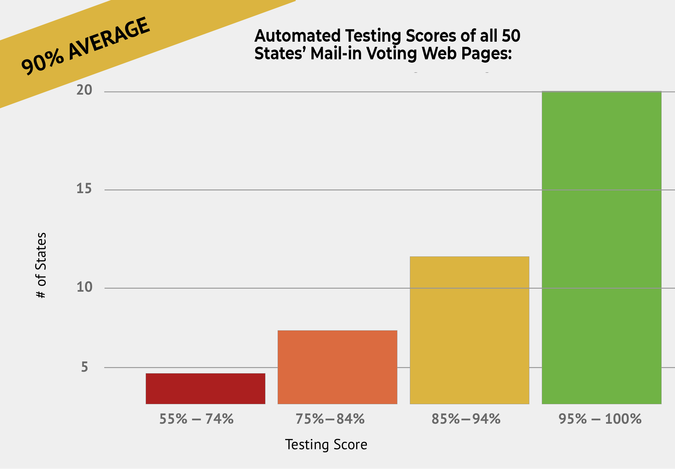
I quickly reminded myself that automated testing has its limitations. While excellent for monitoring and a quick analysis, tools like Lighthouse (free) can only flag up to 30% of possible accessibility errors on a website. What about the other 70%? How do they get evaluated?
It’s done by us. You and I. Humans. There’s no way around it.
Does a positive automated testing score imply that manual testing will be positive, too? My Phase2 colleagues and I set out to find out.
We spent a couple days performing keyboard and screen-reader manual testing of all 50 states, and tracking the manual testing results against the automated results for an average score. The scores went from a 90% average to 77% average. No longer “gracefully passable.”
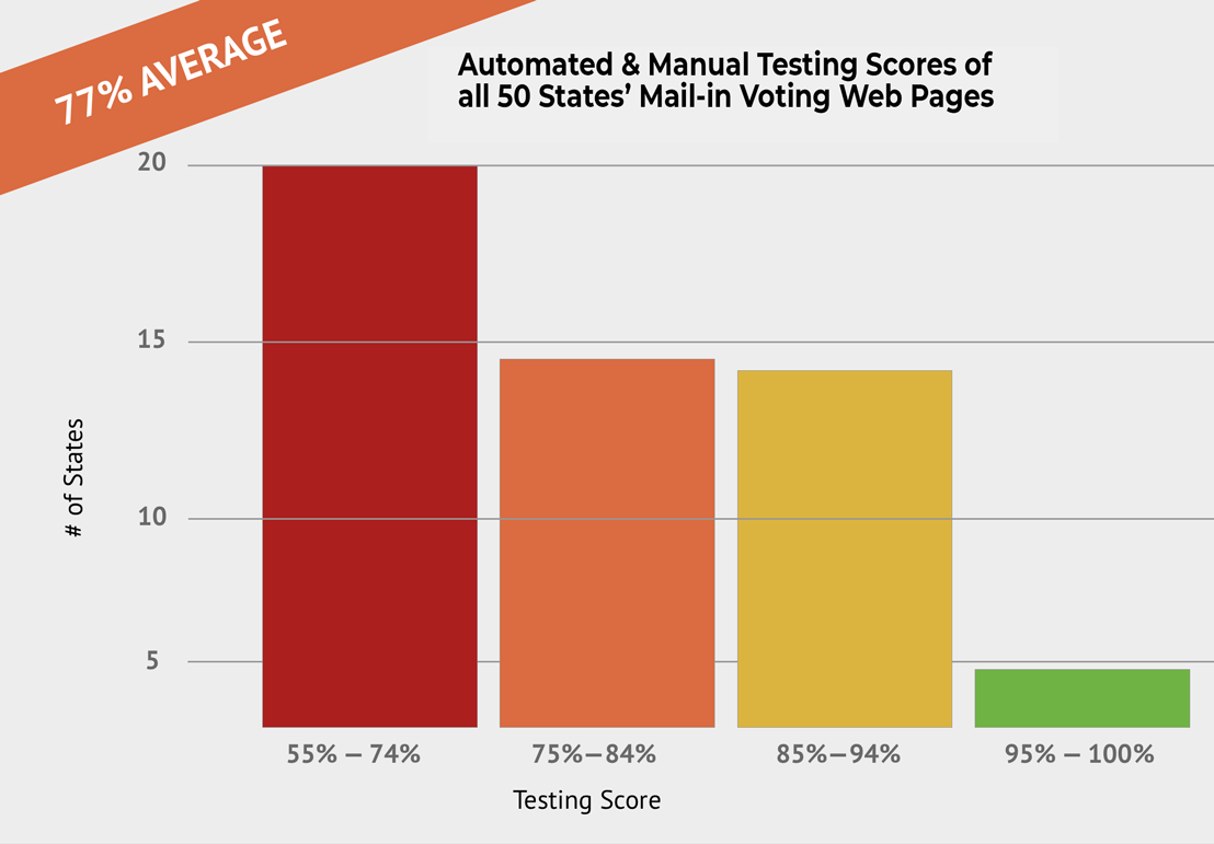
We found that manual testing exposed a more frictious, frustrating experience interacting with the page using a keyboard or a screen-reader. A story that the automated testing couldn’t tell us.
So what went wrong?
At a high level, users who rely on a keyboard to navigate through the web (vs. a mouse, due to lack of fine motor control) wouldn’t have the following experiences:
- clear guidance on their “place” on the page.
- tab order that didn’t flow in a logical manner from left to right, top to bottom, or
- trapped cursor inside a section of the page.
Also users who use a screen-reader to read aloud the contents of the screen due to low vision or blindness didn’t have appropriate context or understanding of the information. The screen-reader information comes through the foundational code of the site. In our testing, we found these experience issues:
- Missing form labels (i.e., search),
- Alt-Text of images were nonexistent,
- Links didn’t make sense alone.
These are all issues that are basic and easy to fix. Accessibility isn’t rocket science. It’s about beginning to understand the needs and best practices to follow. We’ll share a few examples:
Keyboard Focus
People with a motor control disability such as Parkinson’s or hand tremors may prefer to use a keyboard alone to better control the page navigation. Designers and developers need to ensure that keyboard focus is easily visible especially against different color backgrounds.
The keyboard focus is an outline around each interactive element (links, navigation menu, buttons) that provides feedback on where our current navigation position is on the screen. You could say it’s like having a spotlight on different dancers or actors on stage. Without the spotlight, it’d be more challenging to track the main action.
This is a problem in nearly half (46%) of the states tested. Automated testing cannot detect keyboard focus issues or their potential color contrast issues. Want to test on your state’s website? Go ahead and load it up, and start using the TAB key. Can you see the outline around the different elements and against background colors as you go through?
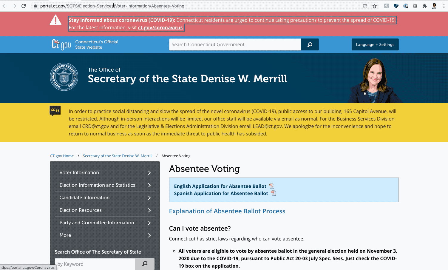
Connecticut has a great example of this because the keyboard focus color changes against backgrounds that are different colors. Too often do I see one keyboard focus color used and oftentimes it gets “lost” against different background colors.
To learn more, visit Google’s WebDev: https://web.dev/focusable-controls/
Tab Order
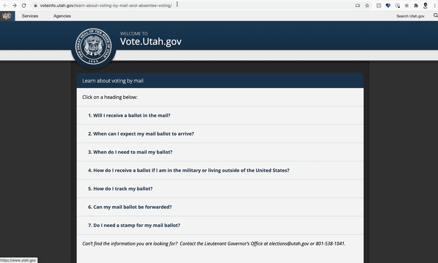
Here is an example of Tab Order gone awry. In the Utah example, you will see it *starts* off in the header with “Services” and “Agencies”, then the Logo, and it goes to the footer. It skips over the main body altogether.
When the tab order does not match the visual order of the screen, it leads to frustration for the user. We need to ensure that all interactive elements on a page are focusable and accessible to a keyboard user.
To learn more about tab order and ensuring elements receive keyboard focus, visit Google’s Web.dev.
Form Labels
A common issue we also found surrounding the presence of form labels — such as the
- search form field.
- the name and address fields, or
- a checkbox.
This is an issue on nearly 20% of all states’ mail-in voting webpages. Form labels are really helpful for blind or low vision users who use a screen-reader to communicate back the *purpose* of a form field.
Secondly, users may use voice recognition or talk-to-text applications such as Dragon Naturally-speaking, iOS’s Voice Control, or Android’s Voice Access to direct their cursor to specific fields on the page. Clearly defined labels make this experience smoother.
To learn more, visit Google’s WebDev: Form elements do not have associated labels
Do Not Use Color Alone to Convey Meaning
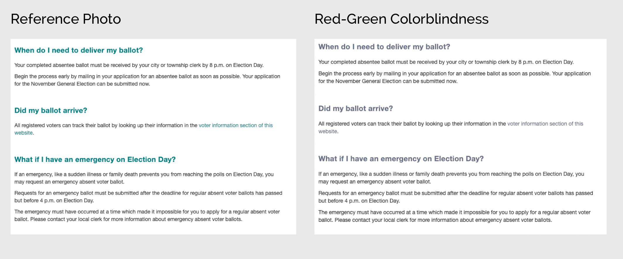
Using color alone — such as a font color change — may not be easily distinguishable to users who have low vision or color blindness. As a quick stat, 1 in 12 men have color blindness. The most common is red-green color blindness (deuteranopia).
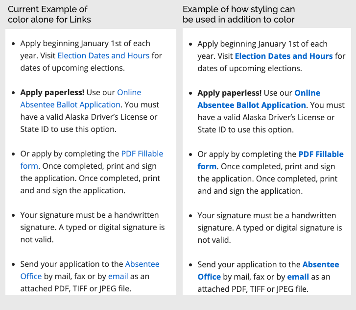
A prime example of when colors may be used to convey meaning are inline links. 34% of all states evaluated were in violation of this. Not all states used the typical visual affordance of blue links, as in the case of this state pictured below that uses cyan-colored links, which is problematic for those with deuteranopia.
A simple fix is to make the type bold. Or add an underline. As you can see in this example below, the current implementation of links uses color alone. An improvement (and to bring up to compliance) would be to bold the text so that it’s more distinguishable by its style as well. Another way that is common on these state websites is use of an underline.
To learn more about Color Contrast and Use of Color, visit Google’s Web.dev: Color and contrast accessibility
Context
Another issue we frequently came across was lack of context or information. Any context greatly helps the user make decisions and jump around the site quickly, whether that’s through helpful link context beyond vague “Click Here” links, or the image alt text that is descriptive beyond the file name as the alt text, or having properly structured landmarks to assist with screen-reader navigation.
To learn more about link text and purpose, visit Google’s Web.dev: Links do not have descriptive text and for Landmarks: HTML5 landmark elements are used to improve navigation
Ensuring our Elections are as Accessible as Possible. In-Person or by Mail.
Automated testing is still an excellent way to help us get started, it helps developers track regressions and some “quick wins.” With time and practice, manual testing truly gives us the best picture of how we are crafting an experience for our users.
Accessibility can be overwhelming, I get it. But perfection isn’t the expectation. Progress is. Over time we all get better, more efficient, and it becomes second nature in our process.
In having this progressive mindset, we make iterative improvements. As a result, we make it easier for citizens to navigate state websites — or any site for that matter — to participate in the democratic process. After all every vote counts.
This is the first in a monthly series of analysis and examples of digital accessibility in our everyday experiences.
Thank you to my Phase2 Colleagues Rachel Broardt and Brittany Alexander for their contributions to this analysis by conducting the manual testing.
Lighthouse Results by State
If you would like the manual testing notes, please reach out to me on LinkedIn or Twitter and I’ll be happy to share!